github ui
I’ve been paying a bit more attention than usual to web interfaces, and there’s a few examples which really get to me. GitHub is one that’s annoyed me for a while, but I didn’t quite know what was wrong until I looked at some screenshots to see what was frustrating me.
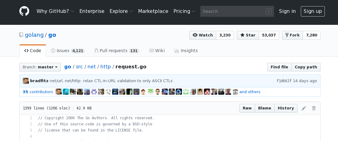
Let’s start by looking at a file. http/request.go from golang.
https://github.com/golang/go/blob/master/src/net/http/request.go](https://github.com/golang/go/blob/master/src/net/http/request.go)

What do we have here? Let’s start at the top and work our way down.
First there’s a row of enterprise pricing signup options.
Second there’s a row with a link to the repo and star and fork buttons.
Third there’s row of code wiki insights tabs.
Fourth there’s a row with a branch selector and file path.
Fifth there’s a short commit, with an amazeballs tooltip, and a row of 35 doodleheads.
Sixth there’s a row with file info and blame history buttons.
Finally, there’s the file itself.
And not pictured, after that, is another row of privacy status links.
That’s a lot of interface! And very little of it seems to have anything to do with what’s happening on this page. 90% of the time I’m on this page, I’m looking for the history button. And 90% of the time, it takes me 30 seconds to find it. I would love to get a hold of the analytics for how many people star a repository after looking at a random file buried somewhere in the tree.
It took me a bit of reflection to realize why it’s so hard to find the history link. That’s the one on the right side of the sixth row. Some time in my own recent history I was probably looking at this page.

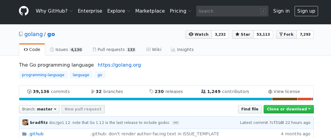
On this page, you get to the history by clicking the big commits button on the left side of the fifth row, just above the rewrite in rust progress bar. Many times when I visit a repo I check the latest commits straight from the top page. So I’m trained to look for the commits link somewhere on the left and then I’m puzzled when I don’t find it.
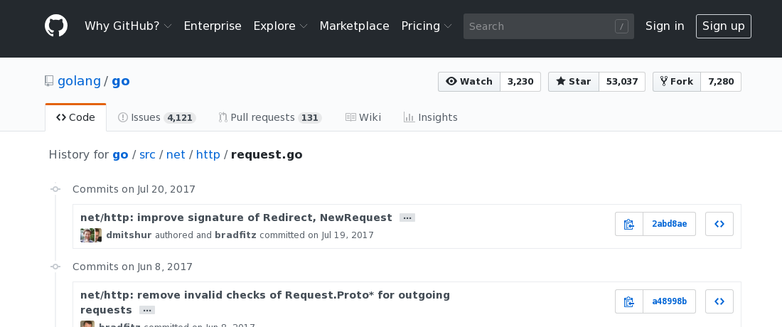
Now let’s look at the history for that file.
https://github.com/golang/go/commits/release-branch.go1.9/src/net/http/request.go](https://github.com/golang/go/commits/release-branch.go1.9/src/net/http/request.go)

Did you notice that I switched to the 1.9 release branch? Is that indicated on the page anywhere? But at least I still have the star button. Can’t live without that.
So we’re missing the branch indicator, or any way to switch back to master. Also missing: any way to even get back to the file. If somebody sends you that link, and you want to see the file, good luck.
Another oddity: where have all the doodleheads gone? Assuming I’m somehow adept at decoding anime faces, and am interested in that information, wouldn’t I be more interested in seeing it on the page dedicated to the file’s history?
There’s all manner of other quirks, like the fact that the code tab will sometimes link to the repo root, but if you are in a branch it links to the branch, but if you’re viewing an unnamed branch, it’s back to master. The releases page is only accessible from a special bonus row on the root code page. And the SPA browser history seems to get confused quite frequently such that back goes someplace unexpected. Or it takes a really long time to reload a page I was just looking at. Or the mobile page is very weird in all its own special ways. I’m not really trying to catalog everything.
Some degree of hierarchical navigation is necessary. I need to be able to walk up from a file to a directory. Or switch from the code to the issues. But I don’t think that requires having global operations like star on every page. Some of the lateral navigation can probably be removed as well. Do I need to go from viewing one file to the wiki? Ideally everything I can click on would fall into one of a few categories. Links that take me up or back. Links that take me down or in. Actions that do something to whatever I’m looking at.